Trish in order to keep the tutorial...
Open a notepad file or any other text program you prefer. Hightlight the text with your mouse and cursor, right click and select copy. In the notepad file paste the text, now in the notepad click File, print. Or you can Name the file whatever the lesson is, and you can open it as you are doing it. Hope this helps. And for a third option, you can just leave the webpage open and follow the instructions. Have fun. Ashley
Search Engine

Custom Search
Showing posts with label Photoshop Lessons. Show all posts
Showing posts with label Photoshop Lessons. Show all posts
Friday, February 25, 2011
Wednesday, March 17, 2010
Irish Pride
 Irish Pride. I should have written this out for you when we did the gingerbread cookies. This technique is useful to change the layout of items. So we have one flat coin or cookie or any number of other things...
This coin is the perfect item for you to use your Transform Tool. Don't worry I filled the pot with the coins shown, but to personalize your layout you can add more to the top or lay them around the bottom. To do this, just drag the coin into your layout and...
- Enlarge the image so the you can view the transformation.
- Click Image (at the top) and select Transform and select one of the tools. (In CS3 Click Edit>Transform. Thanks for the note)
- Each one works slightly differently, dragging at the corner until you have reached the desired position.
- If it has enlarged during the transformation, resize it to a suit your layout.
- Making 3 or 4 different coins, will give you enough variations to look nice. If you want lots of coins just duplicate the layers. Have Fun.
Sunday, January 17, 2010
Photo Filter Lesson
 Jackson had his first snowboarding lesson. The photo seemed a little washed out, actually only one was a good picture of him. I thought this filter option made the scene look a little dreamy.
- Open the photo drag it into your layout (and if you click layer & duplicate layer and run the filter on the duplicate you can easily see the difference when you are finished.
- Click Filter & Adjustments & Photo Filter& here I chose Cooling (82), but you may each option and determine which is best for you. There are warming settings and several colors. Or you can click the color you want and adjust the intensity.
- When you have it finished, with the photo's side by side, you can see the change in the look. If you don't care for the result. Click Edit>undo and rerun the filter with a different setting. And as always Have Fun.
Tuesday, November 10, 2009
Photoshop Lesson
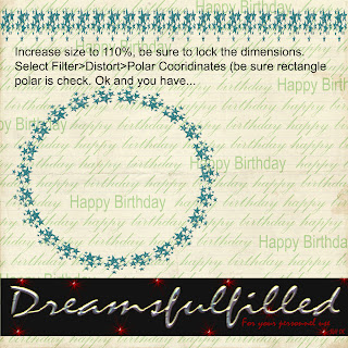 I missed the opportunity to post this, so here we go. You can use any straight element (ribbons and borders) and turn it into a frame or place for your journaling with the polar coordinates filter. If you right click and you can save the photo to your computer (if you want).
- Open a new layout, it really should be 12 x 12 inches, so that there is enough room for the filter to work properly.
- Click Filter>Distort>Polar Coordinates (at the top) and you are done.
- HOWEVER, some elements are not wide enough to connect properly, as was the case of the barbed wire frame, since I was layering them, I just turned the second layer a bit and covered the small gap. BUT if you are not doing that, to correct the gap increase the file to 110% and lock the dimensions together and run the filter in step 2.
- Have fun.
Monday, October 19, 2009
Animation in Photoshop Elements 3
Someone asked me for a blinkie about a month ago. I was painting the house at the time and told her I would do it when I had a bit more time. I write the lessons for my kids, one of them has Photoshop 3. I searched for a tutorial to make a blinkie in Elements 3, to no avail. In the attempt to make a blinkie, well you can see were it ended up. (Yes Barb, you can do this in CS3). So if you have a blog or online photo album and would like to try this.....
You can do this with anything you want to put in motion. Fall leaves rustling across the page. Bubbles from the tub, a ball at the beach. Think big and always have fun!
 Someone asked me for a blinkie about a month ago. I was painting the house at the time and told her I would do it when I had a bit more time. I write the lessons for my kids, one of them has Photoshop 3. I searched for a tutorial to make a blinkie in Elements 3, to no avail. In the attempt to make a blinkie, well you can see were it ended up. (Yes Barb, you can do this in CS3). So if you have a blog or online photo album and would like to try this.....
- When you have a layout finished, save this a .psd (preserves the layers) and remember to save your work as you go, a new file name each time is a good safeguard, don't merge all the layers.
- In the layers palette, click off the little eye of the element(s) you would like to move.
- Now click Layers, merge visible. Turn the shuttle layer back on, and I sized it very small to start the journey.
- For the shuttle, I added a new layer below the shuttle, and with a cloud brush and a light grey, stamped the exhaust. This background provided enough contrast of darks. Now link or lock the shuttle and exhaust together and Layer>merge linked.
- For the text layer, the words were spaced 4 times, so that it ran off the page and could run across the bottom of the page.
- I had 18 finished layers in the preview, but it should probably have about 30-40 to seem smoother. So duplicate the background layer (I don't think you don't have to do this in CS), the shuttle layer and the text.
- Click the eye in the layers palette, so that you don't see the duplicated background.
- Click on your move tool and using the arrow on your keyboard, shift the text left 5 spaces.
- The shuttle is than increased in size, by pulling the bottom right corner, and locking the dimension at 125 %. This probably could have been a bit smaller, to add more layers. When the image is now offset just a bit for the motion. As the shuttle got larger, I added a new layer beneath the shuttle and added a bit more exhaust.
- Now you can click that background back on.
- Repeat steps 6-10 until you are satisfied with the results. (You can have as many layers as you want).
- Save your work. Now you will start merging the layers, so click on one background and the text and shuttle directly above it. Click layers, merge linked.
- Now to prepare it for your blog. Click Image>resize image> (I set) the height and width to 4 inches and set the resolution to 72 dpi.
- Click File>Save for Web>click animation (be sure it is set to .gif). The default for the frame delay was 0.2, I didn't change this. And give it a new name.
- Now you must use a photo sharing site to post it in your blog. I used Photo bucket, and they have an easy way to post it blogspot. (I"ll try to get it written to a DVD to see if it'll play.)
You can do this with anything you want to put in motion. Fall leaves rustling across the page. Bubbles from the tub, a ball at the beach. Think big and always have fun!
Thursday, October 8, 2009
Photoshop Lesson

So I thought we'd start using some of the filters that you have. I have layed out the lesson in the preview. Right click on the mouse, and save image (if you want to keep it on your computer). This takes me about 1 minute, if you are new to the program, maybe 2 or 3 minutes.
- First drag any flat ribbon into your layout (the ribbon file won't have enough room to distort the ribbon.)
- Click Filter>Layer>Distort>Pinch, in this lesson I have set it to 15%, and click ok. (At the top of the screen).
- Repeat this 2 more times, for a total of 3 times.
- Select your eraser tool, from one corner click eraser and HOLDING THE SHIFT KEY, click to a center point, and than to the other corner.
- Now erase the remaing pixels and you have cut a nice edge in your ribbon.
- Add drop shadow and you are finished.
Friday, September 11, 2009
How to extract your own elements
Since a wedding is such an important event, you may want to extract your own elements, such as a cake or rings. To do this...
Open your photo and save it into another file (mine is named extract these), you may want to give it another name and always check the box that say "save as copy". Now close the original photo and go get the copy that you just made (THIS WILL INSURE THAT YOU ARE WORKING ON THE COPY!!!).
- Enlarge the photo to 100 percent so that you can see what you are doing.
- Select your eraser tool (on the left), and choose a hard edge brush, ususally I use a 9 or 13 to begin with. If it seems to large, pick a smaller one.
- Start by holding the shift key with your left hand and the mouse in your right, each click will erase between the 2 points. TRY ABOUT 1/4 INCH, if that looks good than continue around the object, and if not click edit>undo and take an even smaller area between the click points.
- Of course if you are doing a ring the inside will need to be done as well.
- Now you can erase the remainder of the background, if you look at the top you will see an eraser with a *, this magic erase tool will remove all the portions with the same color. HINT! If you are taking the photo, to be extracted use a solid background. Because you have already isolated the object from the background, you can use the magic eraser tool without worrying about it cutting into your object.
- Now pick your regular eraser (go ahead and make is larger, whatever you need) and remove any pixels that you can see.
- REMEMBER THAT YOU CAN SAVE THIS AT ANYTHIME AS A .png, it does not to be finished all at one time.
- I use a pixel check and if you are going to extract alot of files, it's a good investment. BUT, if you just want grandma's wedding ring, we are going to make our own. Save your file, just in case, select a color that is not in your object, for the lesson, I picked red.
- Click edit> stroke outline, a window appears, check the color and set the pixels to 10, and click ok. It will put a red outline around all the pixels in the object, it should be a nice even line around the entire outside (and inside of a ring). Anywhere there is a jag in the outline, that is not in the photo, these are stray pixels that should be removed. If it's your first extraction, there are probably little red spots in the background as well, just select your eraser and remove them.
- Now that all that is left is the red border around your object, select your magic eraser and click on the red and it's gone. SAVE YOUR FILE.
If I can add to this thought. Alot of people are selling digital kits, some do just wonderful work, before you buy from any of them, get a freebie from their work and do your own pixel check, except you shouldn't have to erase anything (just click edit>undo stroke). You really shouldn't have to spend anytime cleaning up files you purchase and it's an easy way to determine the quality of work you are buying. Remember to have fun.
Thursday, July 9, 2009
Knot 1

Knot 1. This lesson will work on any solid color object, but you would change it to grey scale first, by clicking Enhance> adjust color> remove color. Sometimes you would like to use an element, but it's the wrong color, or you would like a different color than in a kit. I have been stressing the importance of learning to use templates, and today you are going to make a very simple one. The knot is provided in grey, white and black.
- Open the grey scale knot.
- Make a new layer, click Layer>new layer.
- Click Layer> group with previous. (or crtl+g)
- Now pick the color you would like and pick the bucket and fill with the color.
- It is solid and you can't really see the cord, so in the preview, shown is 2 variations. In the layers palette, click hard light for an exact color match, multiply will darken the color. You can play with all the available effects, just to get a feel for what they do. Have fun.
Wednesday, May 20, 2009
Berry Boy

Berry Boy
Layering elements for frames, borders, etc. About 15 minutes, faster for those familiar with their programs.
- Open a paper (or new document).
- Drag the frame onto the paper, it should be somewhat centered.
- I started with the leaves, drag into layout and postion on the edge of the frame. You may either, drag the same piece in repeatedly or click on the layer and click Layer>duplicate layer. Now you have a 2nd copy.
- Repeat #3 with all the other elements you want to use. Remembering that in the layers palette, you can drag layers under or above other layers. Resizing pieces until the layout is pleasing to your eye.
- Finished? Unclick the little eye on the paper layer. Click Layer> merge visible. ALL THE LAYERS OF THE FRAME ARE MERGED. Click the little eye by your paper, so you can see it again.
- Instead of step #5. You must click the little lock in each layer of the frame that you have made (#5 is just faster), Layer>merge visible.
- NOW you may position the frame.
Friday, April 10, 2009
Vellum Tags

Vellum Tags. I don't use a lot of tags, but made some "vellum" for the last kit. If you would like to color them, as I did.
- Open the tag.
- Make a new layer, and crtl+g (layer>group with previous)
- Add the color. (I left the setting at normal, you can play if you want)
- Last Layer>merge visible.
- Drag the tag into your layout (Because the file isn't large enough)
- Drag the tie into your layout and duplicate the layer.
- Drag the duplicate layer under the tag layer. (you have one above and below the tag.)
- ON THE TOP layer, erase the area you think should be under the tag.
- Link the 3 layers together, Click on the tag and now in the 2 tie layers, click next to the eye and you should see a little lock.
- Click layer> merge linked. (Now you can move it anywhere you wish)
Wednesday, February 4, 2009
Tarnished Treasures
 Tarnished Treasures
The perfume bottle is in the rose color. Now we want it in a different color. This will let you customize your paper or elements (somewhat), if you ever wished something was a different color, or just a little darker/lighter. It only takes a moment and increases your options enormously.
- Open the perfume bottle.
- Pick with the color picker, (it looks like and eyedropper), and select a color.
- Select, Enhance>Adjust color>Adjust Hue saturation.
- Now, you can click the little box at the bottom that says, colorize. If you are happy, click OK. Note that this will color the entire image, in one color.
- If you don't like the way it looks, unclick colorize.
- Now try sliding the Hue, at about -120 is the lavender colors.
- You can try adjusting the saturation and lightness, if you want to. A little goes a long way. Have Fun.
Friday, December 12, 2008
Snowboarding Elements #3.

Snowboarding Elements #3. The Arrow is not in the elements, it is a reminder to teach the kids about the cookie cutter.
- Open a new document and fill it with color. (If you are trying to match a color in a kit, select the eyedropper and click over the color you want.) or you can...
- Open any paper you wish to use.
- Select your cookie cutter tool.
- In the top, click the drop down menu and select the shape you want to cut. I choose an arrow for the example.
- Start dragging over the paper and the shape will appear. By holding down the shift key, the proportions will be contrained, otherwise you will have a free formed shape. (You can also reshape it after it is cut.)
- You can also hold the space bar and move your shape around, if you are trying to center a pattern in the shape. (I know you are a perfectionist Jack).
- When you let go of the mouse the shape will be cut.
- Don't like it? Click Edit/Undo and try again. (When you close the paper, don't save the changes.)
- When you are happy, add anything else, staples, burn toool, etc or you can do it later. Then drag it into your layout.
Wednesday, December 10, 2008
Black Grunge Alpha
 Black Grunge Alpha.
- So we are going to learn how to use the Rectangular Marquee Tool. These alpha's are in one sheet.
- Open the alpha. (not the preview).
- Select the Rectangular Marquee Tool, on the left, looks like a square with dotted lines.
- This will cut out the letter you want.
- Position it on the top left of the letter and drag it until the entire letter is in the box. Now select Edit>Cut
- Now select your layout.
- Select Edit>Paste. (it should be in a new layer)
- If you want more than 1 of any letter, on that letter (in the layers palette on your right) select the layer.
- At the top select Layer>Duplicate Layer. (you now have 2 a's, t's etc.) and form your word.
- If you really hate doing this, I'll make them in separate files for you. Let me know.
Thursday, November 13, 2008
Candy Land Elements #1

Thanks again for all your kind comments.
If you want your paper clips to appear "attached", place it behind or above the layer you want it attached to (depending on the look you want).
Select your eraser tool (on the left), and on the top of the screen I chose block, to get a square eraser. Now erase the part of the image would not be shown if it were actually attached. I did it both ways for you to see in this layout.
Remember, you can always select Edit>undo, or if it really goes badly, throw away the layer, and drag the clip back in and start over.
Monday, October 20, 2008
Photoshop Lesson The Burn Tool
So Jack was here last week and really liked the frame in October Fest. The paper is however lighter than the frame. I did this so that if you wanted to use them together they would contrast. But it also left me the opportunity to teach you something new. If you would like to darken or age something you will use
The Burn Tool.
On you left you will see a clenched hand, select your burn tool.
On the top select midtones and try it at 100 %. If you want it little lighter, move the percentage down. (remember if you don't like something, just click EDIT>undo.)
You should have a brush selected, I usually use a round default, try a hard edge and a soft edge and see which you like. Also set the size, maybe 200.
Take your brush along the edge of the paper and it'll start to burn or darken the edge. ( I used it over the entire frame and if I remember correctly, I than set it to shadows? and and did the edge). If you want to do the entire sheet of paper, than, set your brush size larger, because it's just faster.
You can change the look of any paper, frame, element this way. Or just do the outside edge and it'll give it that "inked look".
Friday, September 12, 2008
How to turn a photo into Background Paper
Open the photo you wish to use.
First, Click Layer, duplicate layer (photo) I'd discard the orginal layer and then rename the duplicate photo, in order to preserve the original.
Second, Select the crop tool and set the dimensions that you want your finished print. (So if your printing 8.x11, set the width at 8 and the heighth at 11 and the resoulution at 300 pixels per inch) the will let you know exactly what you are going have when you are finished.
Third, Crop the photo and don't worry if it not exactly where you wanted to be. Now until you accept this action, you can move the shape and position it where you would like and when you are satisfied double click on the photo. (Remember you can select EDIT>UNDO CROP if it's not right.)
Now in your layers palette (on the right side) is the little black and white circle click it and click Hue saturation and here you can adjust the hue, saturation and adjust the color. OR...
If you have a color picked (foreground) then select the little box at the bottom left, in the Hue saturation and it will colorize the photo, this can be a very nice look. OR...
At the top of the pick Enhance> Adjust Color> and Color varitions, clicking the lighten option 3 or 4 times can make for a dreamy or foggy look, and make a nice subdued background too.
The last 2 options are my favorites, good luck Jim and if you need help let me know.
Wednesday, September 3, 2008
Scalloped Templates
 I made these scalloped templates and they further your digital scrapbooking. You can use any paper that you download on these shapes. Open your project and drag the template into it. Just positon it below the paper you wish to use and CRTL+g (or layer>group with previous) and you have the shape. You may add drop shadows or bevels, whatever you would like at this time. Download the Scalloped Edge Templates here. Also I added a custom search engine, just above the Dreamsfulfilled title, it is suppose to be geared towards free digital scrapbook kits.
Wednesday, August 27, 2008
Photoshop Lesson 3
1. You can now drag and embellishment into you layout, and resize and move where you would like it to be placed.
2. If you find that you would like something behind another layer, in your layers palette, drag the element below layer you want above.
3. Or you can drag, in the layers palette on the right, one up.
4. Now is when I would usually add any text. Click on your text tool, on the left, and place the cursor approximately where you would like your text. Select a color and font. Start typing.
5. When you are finished, select your move tool, and place it exactly in place.
6. IT IS IMPORTANT, that you flatten the image, before you print. In the layers, at the top, select layer>flatten image. This will discard any information under the layer above it and make printing much quicker.
7. Before, I print, I usually save the file and close it. Than drag it back into Photoshop, because although this seems like an extra step, if it asks to assign RGB color, than select ASSIGN RGB color. This will assure that your print quality.
Sunday, August 3, 2008
Photoshop Lesson 2
Now the most important thing to remember is that when you resize something, YOU MUST DOUBLE CLICK TO ACCEPT THE CHANGE!!!
First, CLCIK ON THE MOVE TOOL (at top left, move your cursor over the icons until you find it in Tools) YOU MUST CLICK ON THE MOVE TOOL BEFORE YOU CAN MOVE ANYTHING. Drag the papers into the postions that you would like, one at a time, if you want to resize anything select the layer in the layers palette (on the right side) and you will see a bounding box, put your cursor at one corner and pull in the direction you would like the layer resized, (if you want the proportions to stay exact, as in a photograph, than just above your work is the w(idth) a LOCK and H(eighth), click on the lock to maintain the proportions and DOUBLE CLICK TO ACCEPT.
Second, Bring your photograph(s) into your layout. At this point I would close the original photo's. DO THIS BEFORE ANY EDITING to perserve the original.
Third, Now you can crop the photo's (if you want)
Fourth, On the left had side, in the tool bar, find the Crop tool (move your cursor over the icons until you find it) and click and drag over the part of the photo you would like to keep. If this is not where you like it just move the box until it is. When you are satisfied DOUBLE CLICK TO ACCEPT. If you are not happy, at the top of the menu click EDIT> UNDO CROP.
Fifth, Now you can resize the photograph for your layout. Remember step one, and lock the proportions, so you friends and family don't turn out all distorted.
Lesson One
I meet another gal last night, who had photoshop and didn't know how to use it. It can be a little tough at first, I think because you don't have a book in your hands to read. I am going to start with the steps to use Digital Kits. So we'll start at the beginning with Photoshop Elements,and list the steps, to begin Scrapbooking Digitally.
First, click on the icon on your desktop to open Photoshop Elements
Second, click on the icon Quickly Fix Photo's
Third, click on Standard Edit (at top right hand)
Fourth, click File> New> Blank File and select Custom and enter the size you would like your layout to be. (as 12 inches by 12 inches, or 8 by 8 or 8.5 by 11) and set the Resolution to 300 pixels/inch. and the color mode to RGB color, and the Background to White or Transparent.
Fifth, Now locate the kit you wish to use on your computer, you can either...
click File> Open> (and locate the kit) or open the file, and drag the paper over the Editor at the bottom of your screen and wait for it to open the program...
then hold it over the photo bin at the bottom left hand corner, and when you see the little square frame with the plus+ sign, release your mouse and the paper will load.
YOU WILL DO THIS FOR EACH ITEM YOU WANT TO USE ON THE PAGE. (If it asks to assign and RGB color, choose yes as it will be important for your printer and the quality will be much better.)
Subscribe to:
Comments (Atom)